Baby Boy Thank Yous, part 3

A few more of the Baby Boy Thank you cards that I made after Monkey was born. You can find the previous posts starting here.

I wanted to make a variety of styles. It’s always fun to try things out, though I might try to streamline things and make several of just a few cards the next time that I need to make a bunch in a short amount of time.


I love this fun argyle print, the bit of shine on the tag, and the little seed bead accents, but I think that the inking of edges makes the biggest difference in this card.


Very simple. Very clean. I am a sucker for a onesie and a tie!


This dot paper was one of my favorite prints from this project, so I enjoyed showcasing it here. I also like the repetition of the square elements, and the two-tone inked edges of the sentiment square.


In my next post, I’ll share my 3 favorites of the baby boy thank you cards that I made! It was hard to pick. I don’t love every card that I made, but there are at least 2 that narrowly missed the cutoff. I hope you’re enjoying these and have been inspired. Please share with me your thoughts on these! I want to grow as a crafter, and I’d love to know your opinions and ideas!


COMPLETELY BESIDE THE POINT: I said once that I’d keep track of all of the words and phrases that this blog spell check does not recognize. I haven’t always done that, but here are today’s: crafter, onesie.


Baby Boy Thank Yous, part 2

I think I’ll have 4 posts in this series. I made duplicates of several of these cards, depending on what supplies I had on hand. It was fun to match up each card with a recipient!

I designed this one on my Silhouette, then tried several different combinations. I like it, but I don’t love it. This is another one that I’d like to revisit and change up a bit. I have definite preferences for some color and pattern combinations than others. I was working with a limited stash, and felt like I needed to use as much as I could, even if I wasn’t thrilled with the results. These are posted from my least favorite to my favorite of this set.

Baby Boy Thank yous

The first of a few posts with some thank you cards that I made for gifts, meals, etc. after Monkey was born.  I like some more than others. Which one is your favorite?

Proof that I need a stamp positioner. I’ve seen some DIY versions that I think I might try.

This one almost made it into the top 3.  I just like it. The design is simple and understated, but the patterned paper makes it fun and eye-catching.

I loved the embossing of the foot stamps. It really emphasized the fine lines and little imperfections that make them seem real. The embossing on the sentiment is less than stellar. I should have redone it. Leaving a smidge of border around the edge would have been an improvement. This one just begs for dimensional adhesive!

I’d love to hear your thoughts about which ones you like best, or what could be done to improve them. I know that dimensional adhesives would work to really add layers and interest to several of them. I just bought some, and I’m sure they will be a new addiction in papercrafting! I also think that the paper choices in several of them could be better. I bought a bunch of single sheets, and a collection would likely have worked better. There are some lovely boy themes out there!

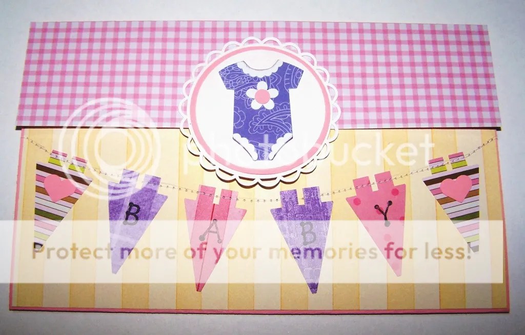
Sweet Baby Girl Card

I was so very proud of this one when I made it. I designed some of these shapes myself – the onesie, the little lace edging on the neckline and sleeves, and the delicate scalloped circle. It’s hard to see in the picture, but this is a tri-fold. The yellow portion is a bottom flap, and the pink gingham folds down over it. The circle embellishment overlaps to help keep it closed. It’s a great design if you want to make a nice, long note inside. If not, it can leave a lot of empty space, so consider carefully how wordy you are feeling, or how big your handwriting is!

I like the colors on this one. Pink has grown on me a lot since having my first baby girl almost 6 years ago, but it’s still not my favorite color. I like it quite well in certain combinations, especially bolder, slightly funky colors. I think it’s fun and it adds a little punch to what can otherwise be a little too sweet for my usual tastes. (I want to say that it would be a bit ‘twee,’ because this is my newest favorite British word that I wish we used in the US! Chuffed is another.) If I ever put those little hearts on the banner again, they will be in a color with more contrast to the background, or I’ll ink the edges. They annoy me without that touch. I think some dimensional adhesive would really give this card some life and take away the very flat feeling. So, even though I like this one, I see lots of potential for improvement!

I should make a list of all of the cards that I want to do again, but better. That could keep me busy for a while, but I think I’d enjoy seeing how my style and techniques have progressed. What do you think? Make it a mini-series in the future?

Bright Birthday Card

I haven’t had much chance to blog for a few weeks. I blame it on the Olympics!  I have several photos of cards I’ve made, so I’m going to do a little series showcasing a few of those. If you have any questions, I’ll do my best to answer them, and maybe it will even lead to some tutorial posts or further inspiration.

Today’s card was made for a birthday card swap that I’m in. My Silhouette SD machine was packed away while I did some reorganizing, so I cut all the pieces by hand. I absolutely love the front of this card, and I’m definitely using this idea again. I just used one flower stamp and several different colors of Crayola markers instead of stamp pads. I used the same markers to color the stamp on the inset, and tried to get the colors close to the papers I used for the pop-up inside.

I wanted to do something fun for the inside, so I made a pop-up birthday cake. Originally, I had several different pop-ups making a dimensional pile of presents, but my brain stopped working around midnight this night, and I had a major mistake and had to start over. Thus, the birthday cake. I still like it, and I think the pennant on top pulls it together and keeps it from being too bare.

The inside is okay, but my main thought is “I can do better!” It’s an idea that I’ll revisit in the future. I know that the recipient enjoyed it, and that’s the most important thing!

Unfortunately, this is a card from before I started tracking my supplies, so I can’t tell you what papers I used or where to get them, but I think it would be quite easy to do something similar with whatever supplies you have or can get at your local craft shop.

Framed art for a friend

Butterflies again. I can’t help it. I love them!

Sunflower Spinner card

I made this card for a birthday card exchange. I have a friend who just loves sunflowers, so I knew I wanted to include one. She’s also the kind to appreciate a bit of whimsy, so I made her this spinner card.

It’s simple, nothing too fancy or girly for this chick. But it has an element of fun. See that little shadow of a string to the top and bottom of the sunflower? That’s so it will do this:

I always twist it up just a tad, so it will spin when opened. The only downside to this card is that having that big hole meant a teeny place to write Birthday greetings. I added a little ribbon bow and a touch of bling to finish it off. It’s not exactly what I originally envisioned, but I think it’s nice. Not super-wonderful-fantastic, but I know she liked it and appreciated the personal touch of a handmade card.